10 Product Design Trends in 2021
Because our studio has been designing products for over a decade, we understand the importance of forward-thinking, innovative design. Here are 10 emerging trends that have inspired consumers and designers alike:
Soft Edges
There has been a softening in product design over the last few years.
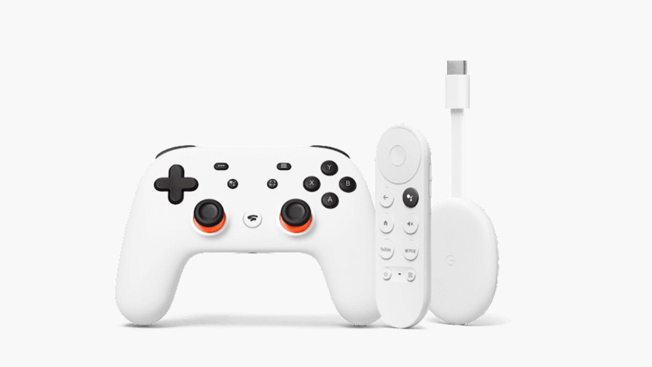
The sharp edges that defined so much of the 2010s are being smoothed down and rounded out. You can see this in products like Google Home or Apple airpods: there is a distinct soft, doughy shape to them. Think of the robot EVE from WALL-E: smooth, round, and seamless design.
Simple Silhouette + Macro Details
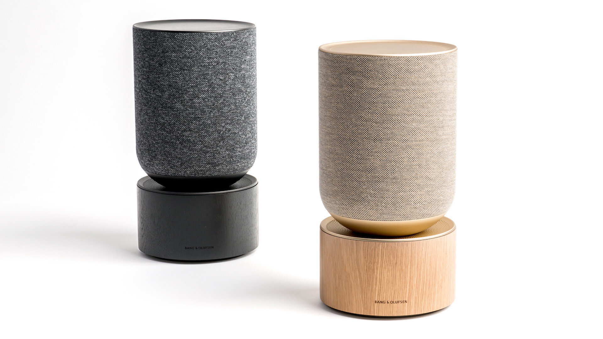
Many product designers have been combining a simple, almost monolithic silhouette with beautifully subtle details that emerge the closer you get to the product.
Natural + Bespoke Materials
Natural meets engineered materials
We’re seeing a lot of products combine more bespoke materials like brushed aluminum, satin, or leather with woven, natural materials. Combining these seemingly disparate elements is another way to create surprise and delight as consumers interact with their products.
Color
Vibrancy and colors are back!!!
In the 2010s, product design trended towards high contrast; a lot of black and white, or brushed stainless steel and gloss black. But in this new decade, it appears as though color is making a comeback. At least, according to Apple, it appears to be.
Subsurface Glow
Design is more than skin deep
From the glowing green vent of the newest Xbox to the ambient light of car consoles, the subsurface glow trend has really caught on. As our studio designs a lot of airplane interiors, we do worry a little bit about the challenge of affording the beta testing for this particular interior design component. But practicals aside, it’s clear that consumers are loving this layered effect.
Featureless (but usable)
Uncluttered and intuitive
Imagine a laptop or phone without any ports at all: no cables, SIM cards, or USBs. That’s what we mean by a “featureless” product: a self-actualized object that can perform, interact, and recharge either wirelessly or through induction. To a certain extent, we’re used to having very concrete, physical interactions with our objects, but featureless products will encourage a more subtle, intuitive connection. We believe that industrial design will prioritize these featureless products.
Screens as an Environment
Screens set the ambiance.
This design trend is a very recent development, and so far, Jeep has done it the best with their Wagoneer Aur. There are screens everywhere in this vehicle, but they synchronized them all to treat the entire cabin as a single screen that can project the night sky. They use the dashboard to transform the whole environment. We’re really looking forward to seeing this trend continue and even evolve beyond car interiors.
Configurable // Foldable
Products are no longer static, they are kinetic and suprising.
It took us two decades, but we have finally landed on the ideal phone size; no more tiny Zoolander phones or outrageous “phablets”. Now the question is, “Can we configure these objects? Can we fold them? How do we make them more than what they are, without making them any larger?” This design trend has worked well for consoles and laptops. It’ll be interesting to see how consumers respond to foldable, configurable smartphones.
Product as a Service
Product design to complement a service
It used to be that the function of a product (what it was made to do) was fulfilled by the product itself. Think of an analogue watch: the watch fulfills its function by accurately displaying the time. That’s what it was made to do. Nowadays, products are still being designed to perform a function, but consumers can only access that function through a subscription service. Consider the pill dispenser Hero: the machine itself costs almost nothing, but the service is really expensive (and also really cool). Designers are now creating products that function primarily as conduits.
“Nichification”
Products made for you by people like you
Companies used to focus on creating products that could appeal to a wide audience. But recently we’ve noticed a trend we like to call “nichification,” or the idea that companies can successfully market products designed for a very exclusive audience. We’re seeing entire product lines that speak to niche audiences: computers and accessories specifically for gamers; insanely expensive (and well-designed) yoga apparel for wealthy, crunchy Canadians; recycled plastic Nikes that look...well, recycled. In a niche market, designers have to be way more engaged in the products, but it’s paying off big time. The rise of social media has created ad infrastructures that can market products to precisely the right audience.
Want to learn more about industrial design?
Our studio likes to stay ahead of the trends, but we also appreciate the value of timeless design elements. For more information, you can read our blog, check out our design process, or contact us directly.


