Showcase: The Kestrel Turboprop
Design EyeQ Studio was hired in 2010 to design the interior of the Kestrel, a turboprop airplane. The studio reviews their process and the final product.
In 2010, Design EyeQ was hired to design the interior of the Kestrel, a turboprop originally developed in 2006 by Farnborough Aircraft. Production of the aircraft stalled in 2012, just after Kestrel Aircraft built a beautiful model, complete with luxury materials and avionics. Though the turboprop never took off, the interior we designed is worth revisiting.
Turboprops are planes with a turbine engine that powers a propeller. Turbofans (i.e. typical business jets) gather speed as they gather thrust, accelerating over time. Turboprops work more like a car, where the engine revs up then levels off.
All that pick-up-and-go meant the Kestrel could take off and land on short runways. For the millionaire sportsman, the Kestrel would have been a dream come true. It could land on the gravel road beside a cabin in the Grand Tetons, for example, fully outfitted with gear and supplies.
The Process: Neurons to Sketches
Before we started sketching, we wanted to define the design’s brand language, or the colors and forms we would use to create a cohesive theme throughout the aircraft. We landed on a visual brand that we named “Napa,” largely inspired by rich, natural materials as well as banded forms, like wine barrels.
When designing the cabin, the big fuselage provided a golden opportunity. We could create what amounted to a luxury living room given the generous weight capacity of the aircraft. That also meant we could craft cabinetry and seats with bespoke materials consistent with our brand language.
We were also responsible for designing the control panel. We wanted to do something different with flight controls, something a lot simpler than our competitors.
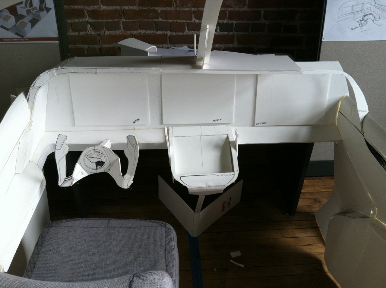
In conjunction with our sketches, we did full-size mock-ups.
The whale bone structure we named “Woody,” and the insulation model we named “Foamy,” respectively. These 2D models are largely what made our process so successful. Each piece and part was based on our CAD model, and if we made a change to one, we made a change to the other.
At one point in the process, the cabin walls were so thick that when you sat down, you couldn’t straighten your head. Imagine making that mistake when working with the real materials! In design, starting that circular reference early on in the process is so important.
We also modeled the avionics in 2D, creating panels that we attached to the dashboard using velcro. The CEO and engineers had a lot of fun arranging and rearranging the model as they saw fit. Then we sketched over the 2D model they (finally) agreed on.
The Product:
Cabin Luxury
When designing the cabin, we wanted to balance beauty and practicality. We achieved that balance with the cabinetry, where we designed a flex storage area with removable modules. The final product was efficient and luxurious.
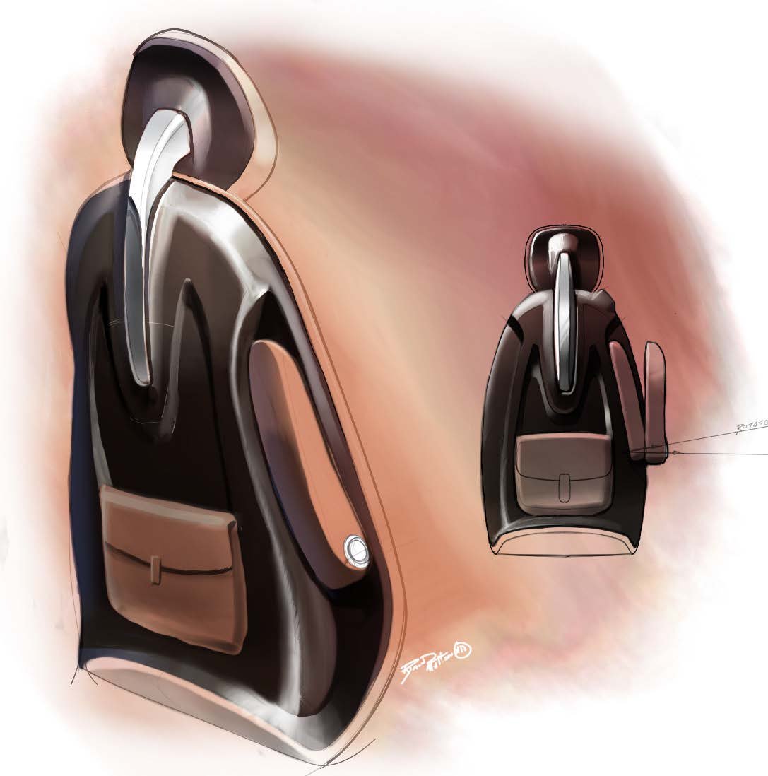
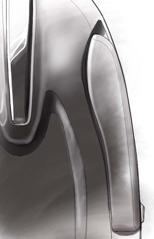
With the seat design, we really zeroed in on our brand concept. In this sketch, we modeled the “tension and interaction” form that was central to the design. This form was inspired by wine barrels and rolling hillsides.
This banded form had practical implications as well as aesthetic appeal. Bisecting the window with a band was consistent with the design theme, and it meant that the suede wouldn’t tear around the circular windows (a problem we’d seen in other planes).
We designed the touch-sensitive task lights in the cabin purposefully low so they wouldn’t bother the pilot.
Building customization into the design of an aircraft isn’t common, but it’s a lot of fun for the owner. We wanted to leave as much of the seating surface open to interpretation as possible.
People like to talk about their pets. Pilots like to talk about their airplanes. We gave them a talking-piece with this removable back-of-the-seat knapsack, complete with the Kestrel logo.
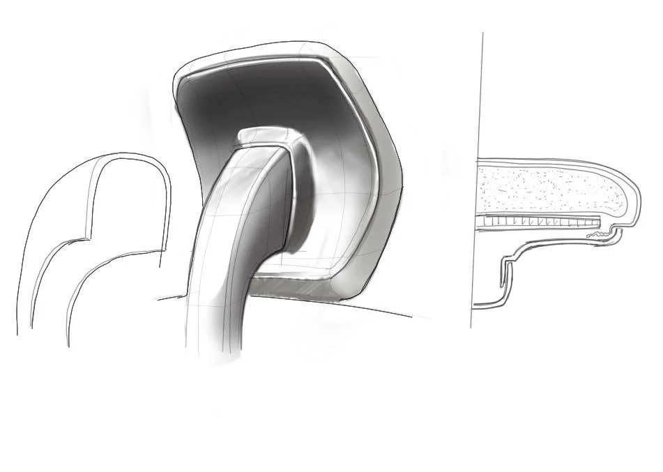
For safety reasons, the headrests in this plane had to be ginormous. It took quite a bit of creative power to make these massive squares appear thinner.
Engineering with Imagination
We believe that good design challenges engineering, and good engineering inspires design. Our studio likes to turn up the heat


